MUSIC: BRANDING & PACKAGING DESIGN
GLARE
Glare is an alternative/shoegaze band from RGV, Texas. "Heavenly" is their first proper release on Sunday Drive Records.
TEAM
Designer — Jonathan Lee Gonzales
Header Photo — Raymond Torres
Photos — Nine Koepfer & Kari Aguirre
PROJECT
Glare and Sunday Drive Records have worked together for a few years and released short EPs on cassette. "Heavenly" is their first proper EP, and also the band's first vinyl release, so in addition to the album art and layout, a rebrand was completed to give the band a consistent identity to live across tour posters, album art, etc.
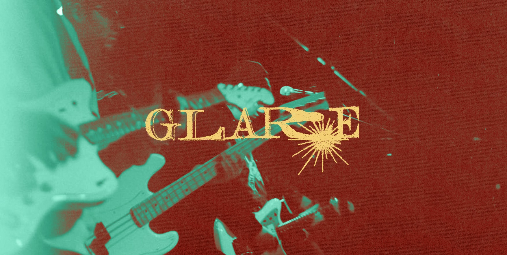
LOGOS
After using multiple logos across different releases, an official logo was needed. I wanted to create something that properly visualized the word and hazy, loud soundscape "Glare" has. I designed the wordmark using a serif typeface, then manually distorted by hand with a scanner, and added a sunbeam to the bottom that pulls in 'R' and 'E'. In addition, the sunbeam can be used without the wordmark as an alternate logo.
ALBUM TITLE
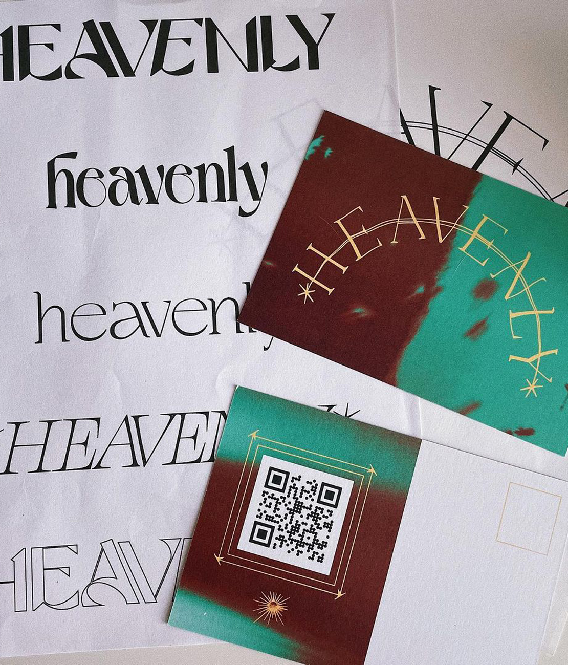
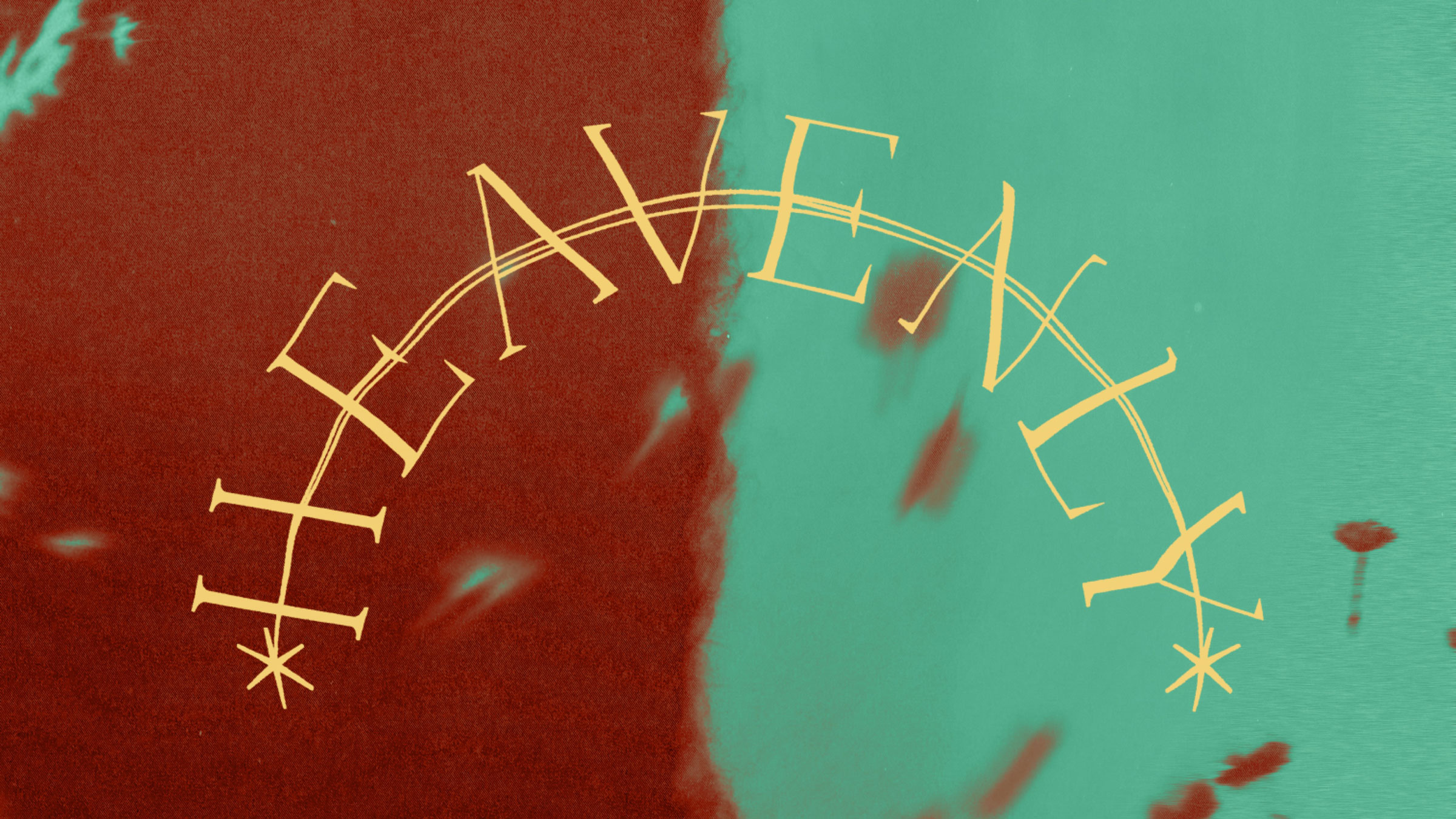
When the band told me the album was going to be titled, "Heavenly", I knew I wanted to represent this in a grand way. In a similar way to the logo, I designed the type using a typeface, created an arc, added a shooting star through the letters, and finally, manually distorted it to have a similar look to the logo. Pictured to the left is the title printed on postcards with a QR code on the back to a private link to an unreleased song. In the background is a test print of different iterations of the title. The postcards were given out at Glare's show in Houston, TX, and then mailed to everyone who ordered merch in the past as a teaser to the upcoming release.
ALBUM ART
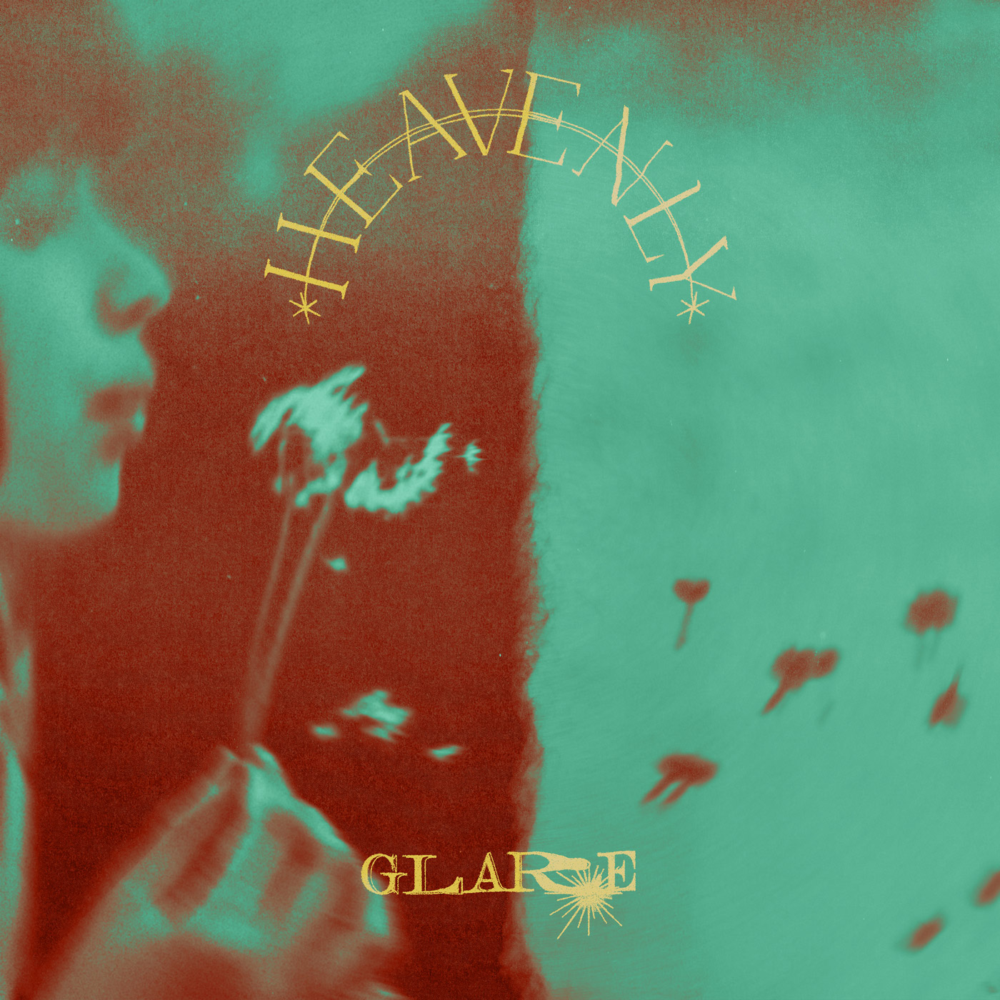
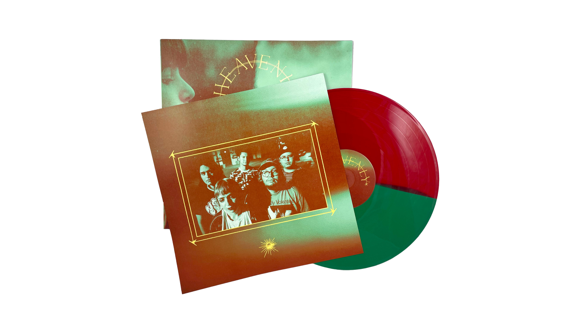
The album art utilizes the two titles, positioned in a way to create a negative space of a "Heaven's Gate" arc. The background photo was chosen to create a feeling of "Heavenly" vs straight-forward Heaven imagery. The photo was distorted and duo-toned to with a split in the middle to allow the gold lettering to stand out.
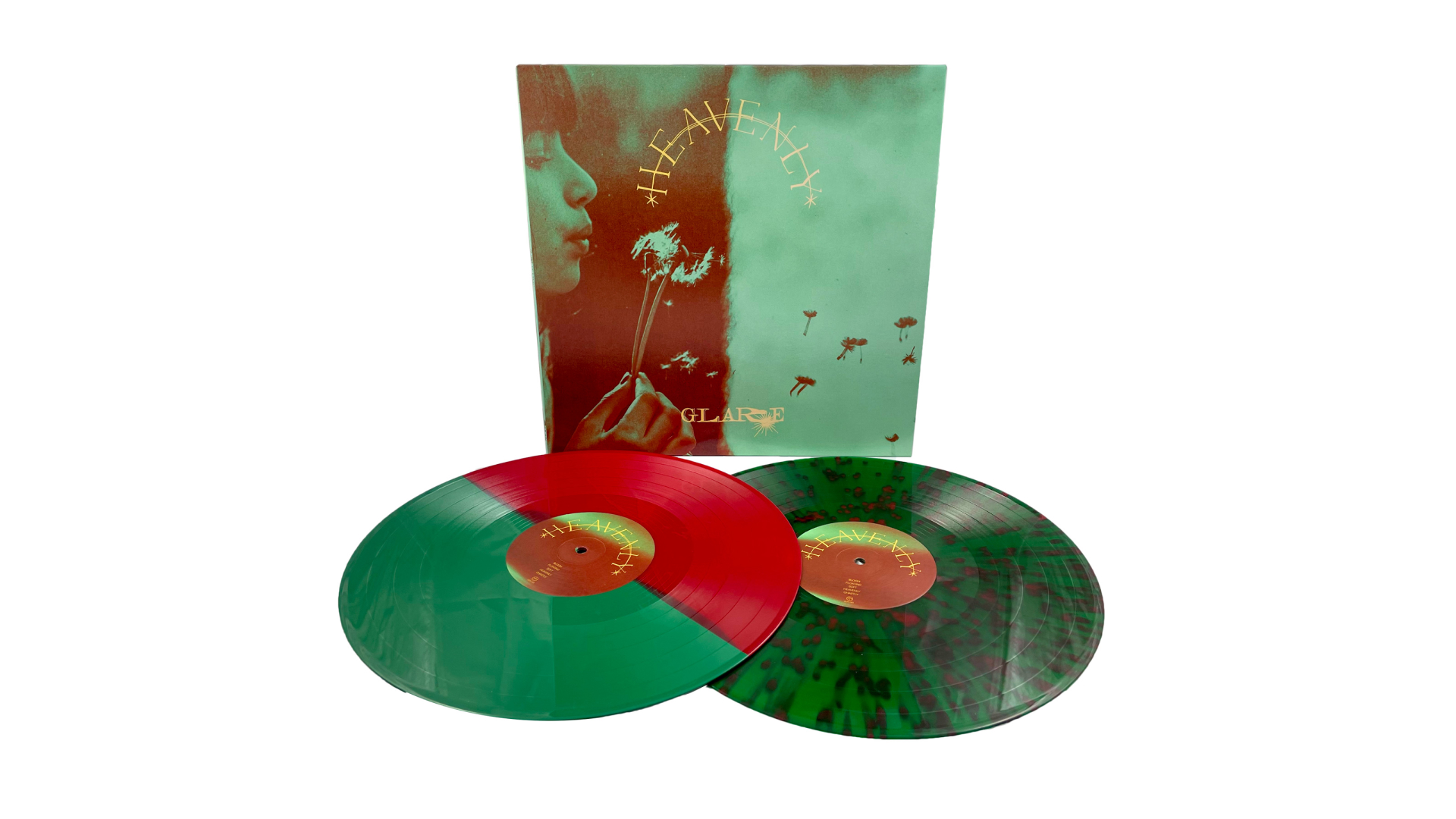
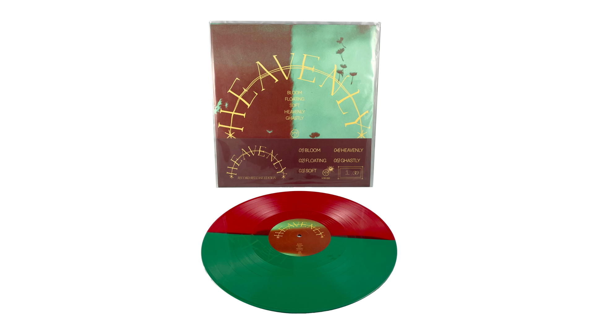
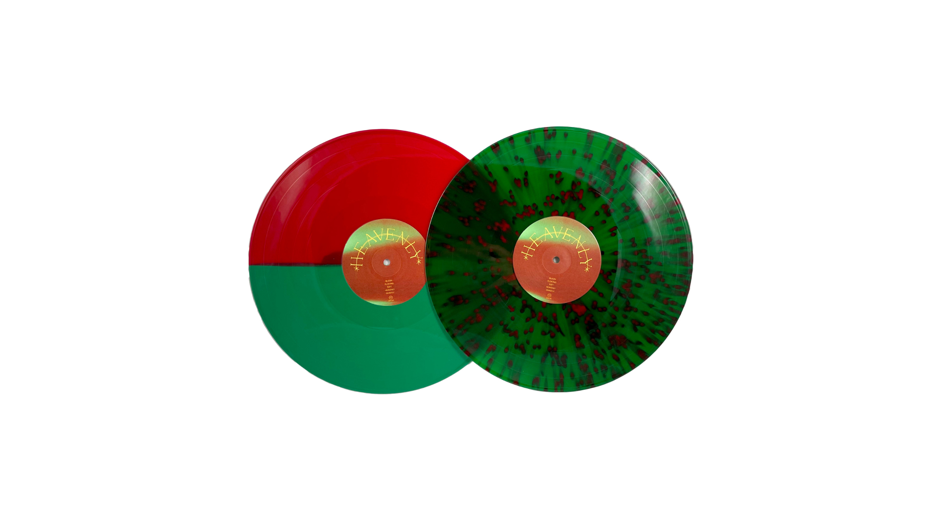
VINYL
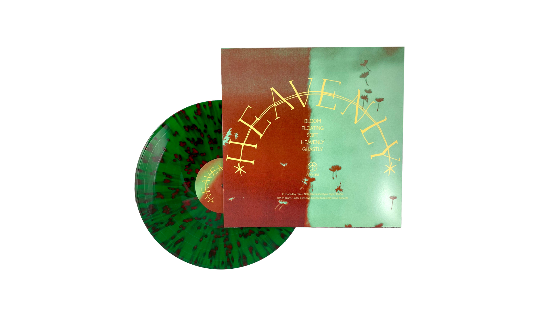
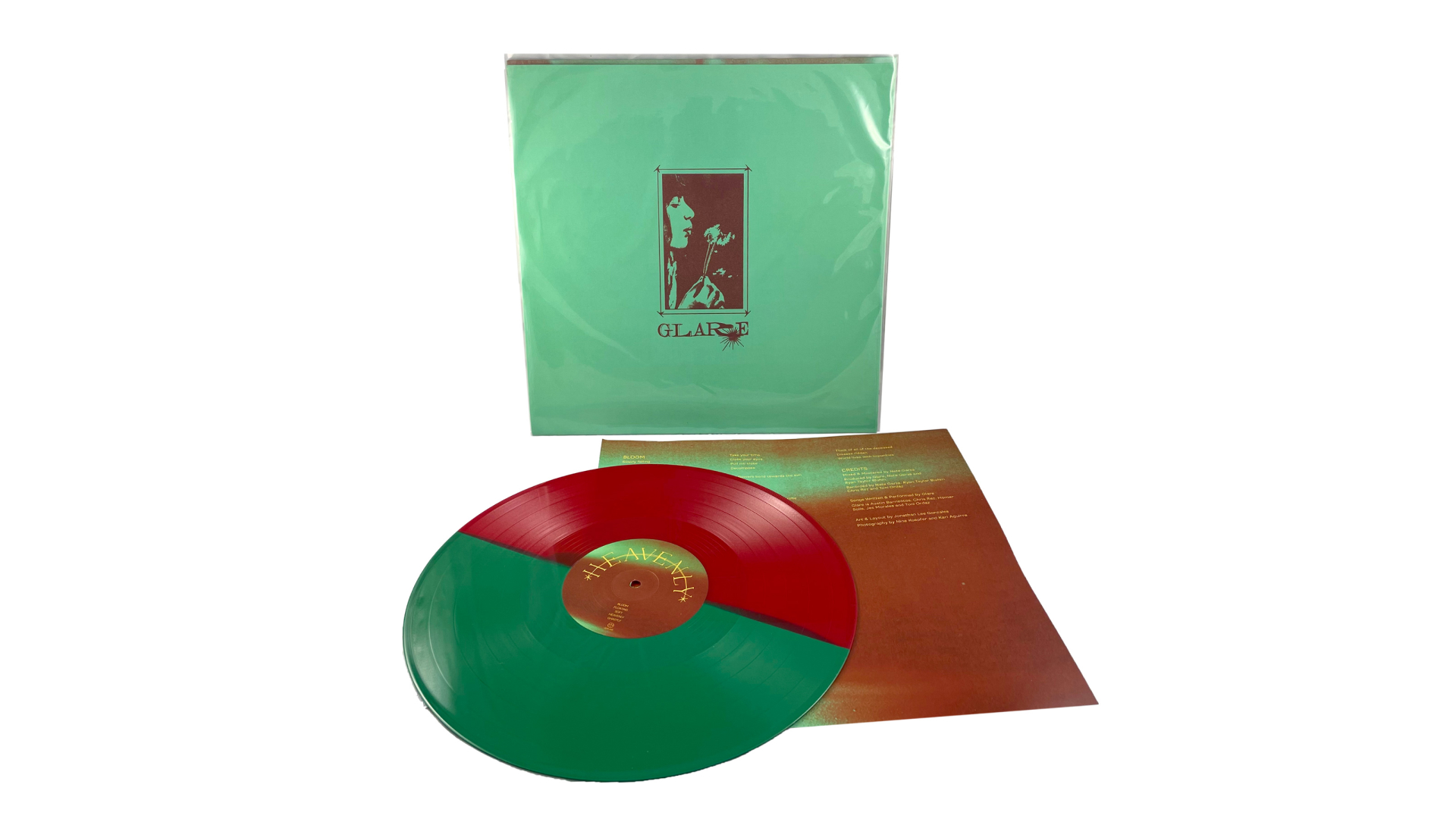
For the first pressing, "Heavenly" is being pressed on two variants to match the album art. The half/half and then splatter to mimic the dandelions in the wind. The fourth and fifth slides also show an alternate, record-release edition art, exclusively for sale at Glare's release show. These were printed and then scored and hand-numbered by myself to fold over the original art.
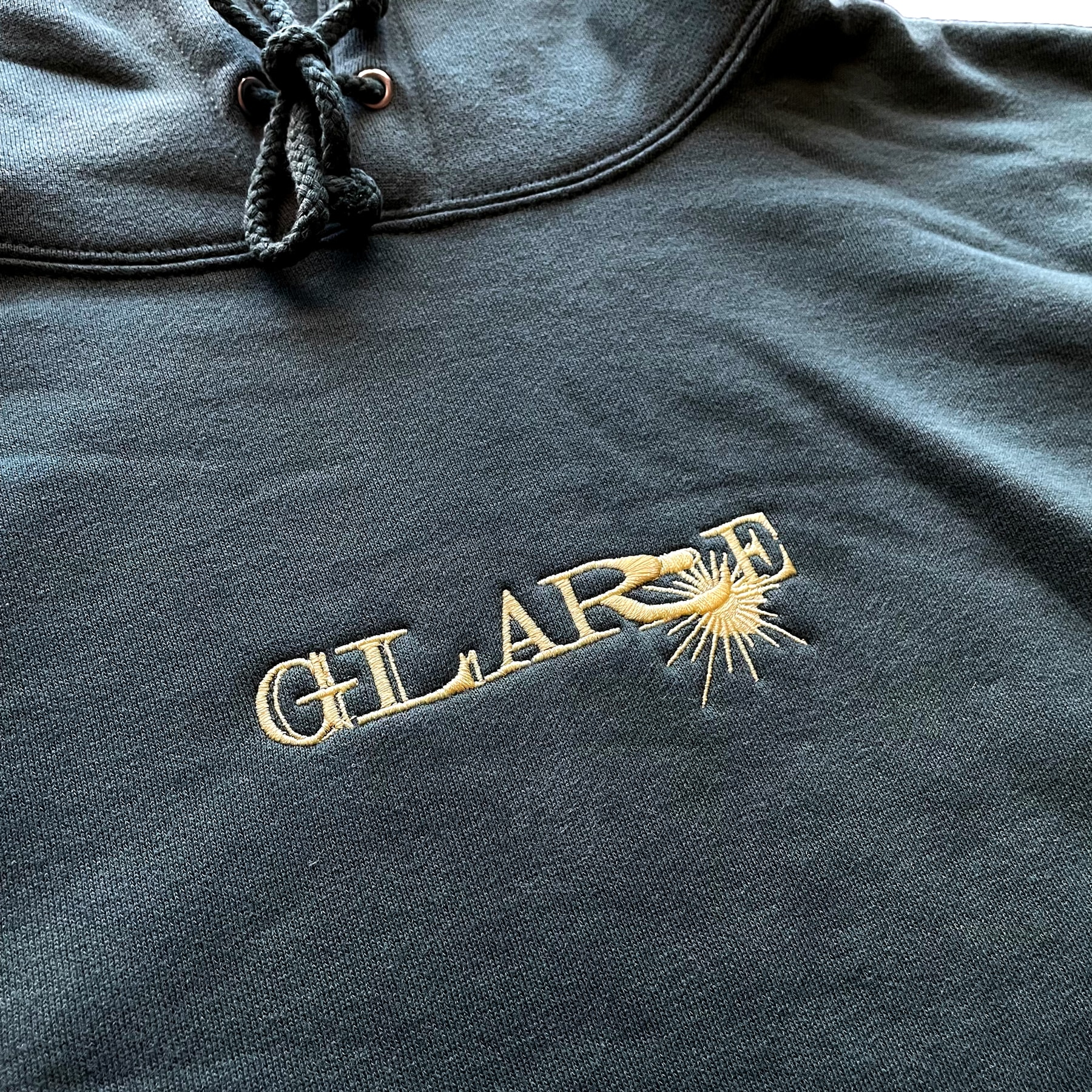
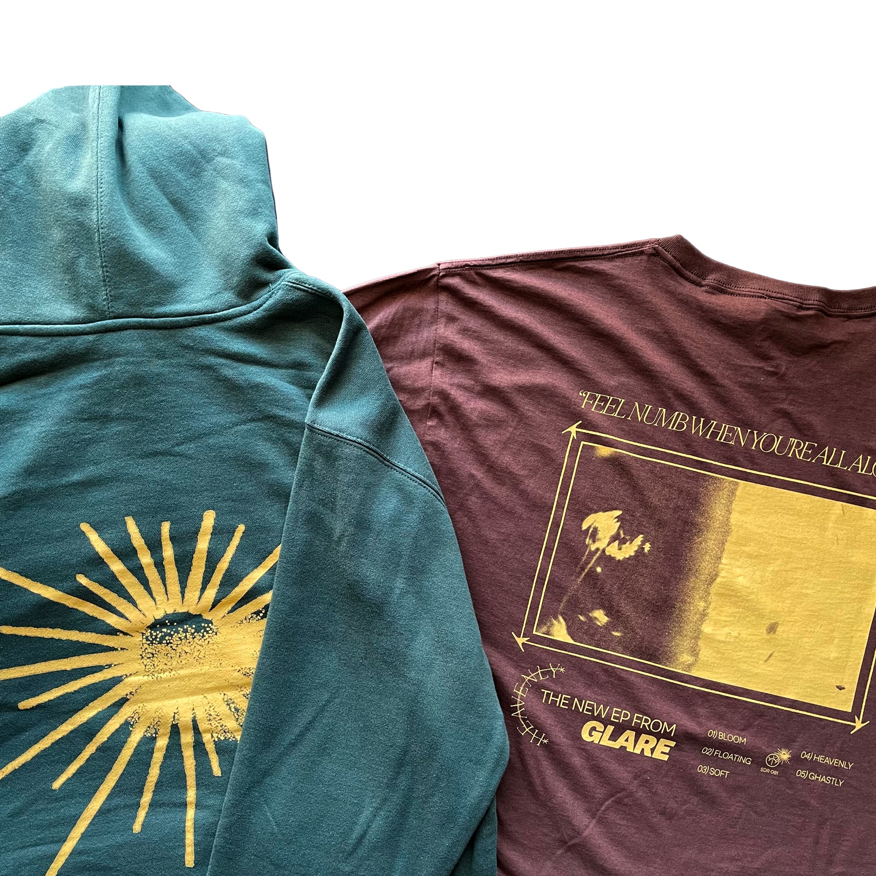
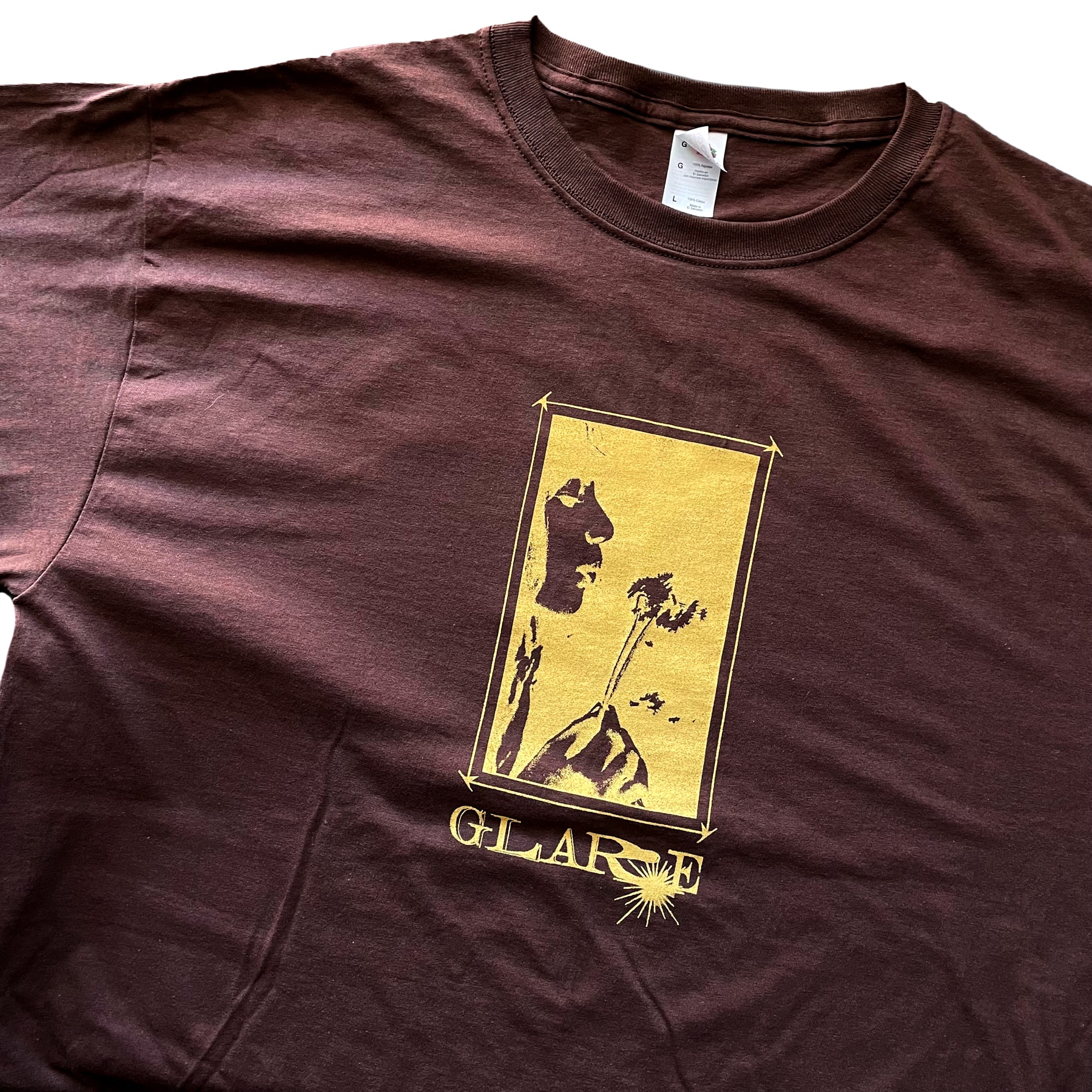
MERCH
In addition to vinyl, limited merch was designed to pre-order using similar assets to the vinyl. The pieces were a simple embroidered logo hoodie to the left, and a screen-printed long sleeve to the right with a "Promotional" design on the back listing the tracks and lyrics. All of the colors chosen were to be consistent with the album art.
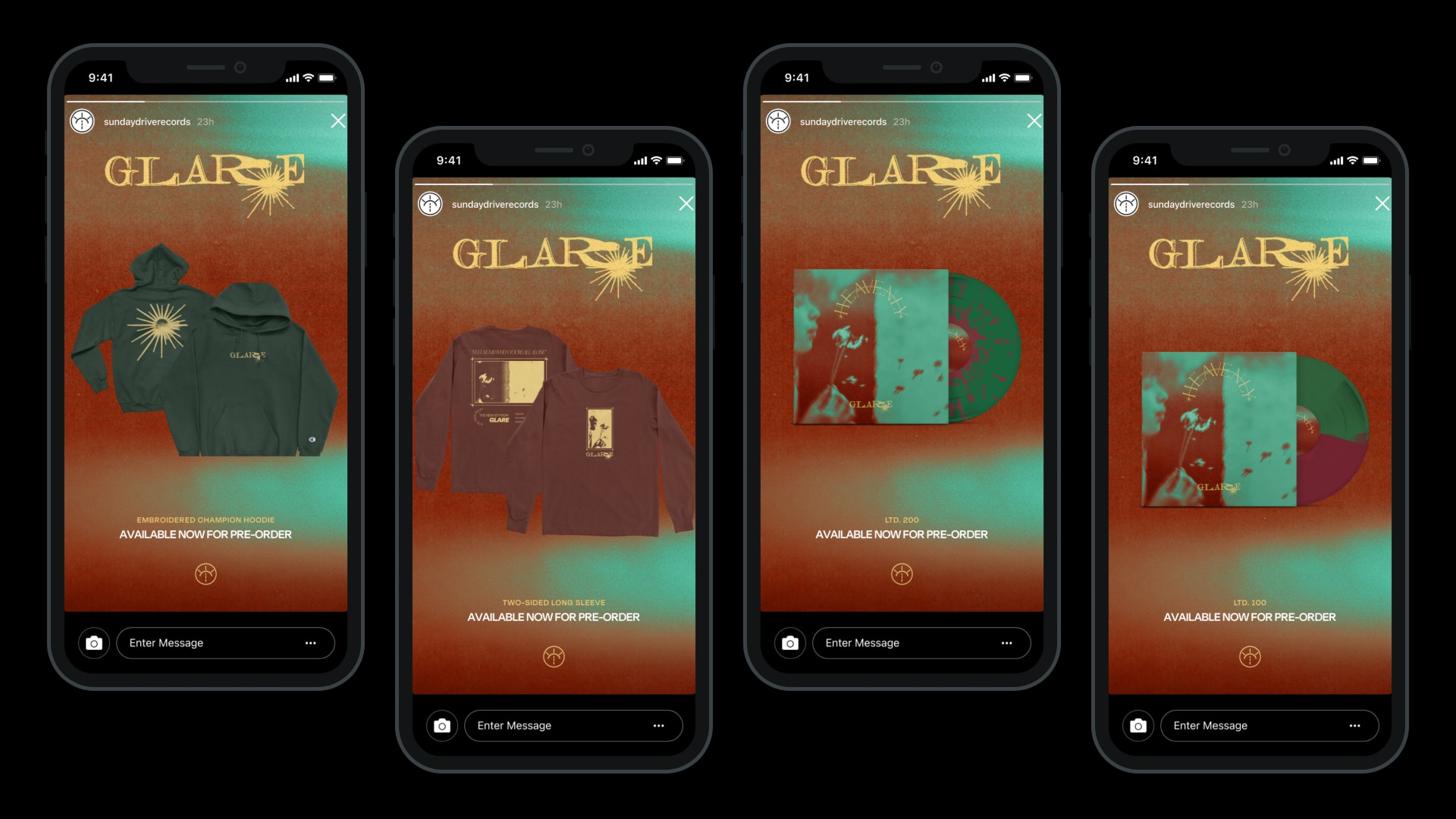
SOCIAL
Templates used to promote merch on social media, and an animated teaser video on the left to announce the album and pre-order date.
SAY HELLO
©2022 Jonathan Lee Gonzales