WEB DESIGN
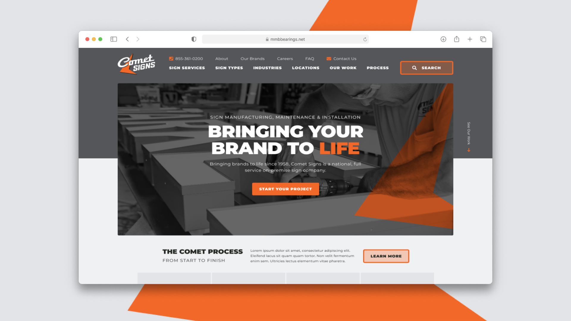
Comet Signs
Bringing brands to life since 1958, Comet Signs is a national, full-service on-premise sign company based in Texas.

TEAM
Web Designer — Jonathan Lee Gonzales
Developer — Shonna Orechio
Project Manager — Grant McCracken
Team Lead — Madison Wilson
SEO Specialist — Tamara Perkins
AGENCY
YEAR
2020
Project
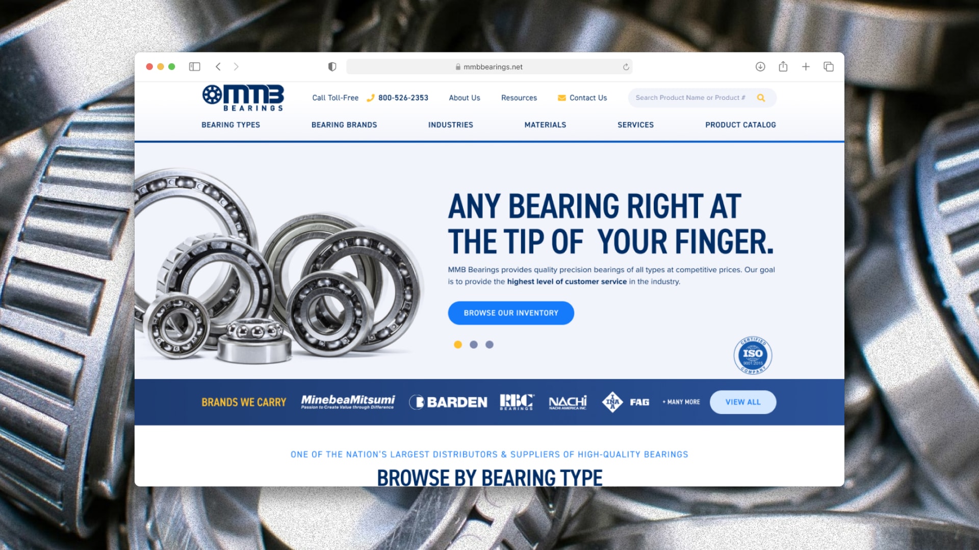
Since their last website design from 5+ years ago, Comet Signs had grown substantially and their site did not accurately represent what they are capable of. Their older site was more focused on serving the Texas area, but they were now able to serve nationally. Comet Signs had also grown as a brand, having multiple subsidiary brands. They reached out to TopSpot to better display themselves on their site, along with an updated look & feel from their recent rebrand.
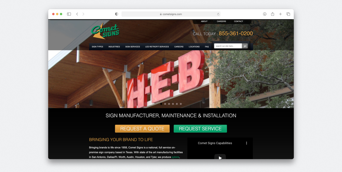
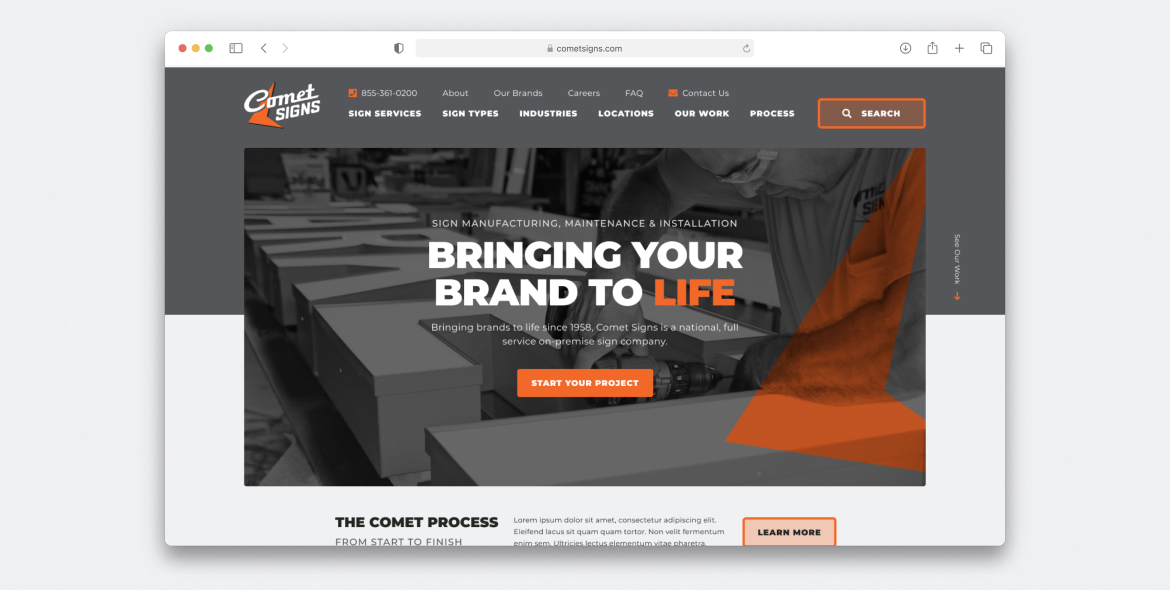
New home page vs. previous. The new shows emphasis on the new, bold branding with the process section peeking below.
Process
After our project kick-off meeting with the team and client, I took my notes and made a quick sketch to wireframe some of the important elements I knew we'd need to show. This includes a section for Comet Sign's process simplified in 4 easy steps—from design to installation + future maintenance.
Below that, I knew we had to introduce their services offered and the types of signs they create. I had the idea to create the sign type section as a mini-portfolio right on the Home Page, so if a potential customer saw something they liked, they can click into that sign type to see more and convert.


Design System
After wireframing, a design system was built in Figma with typography, branded colors—which were slightly altered from their print guide to passing WCAG guidelines—and some components that would be used throughout the site.


User Flow
FROM BROWSING SIGNS TO STARTING A PROJECT
Once the user is on a detail page, they are introduced to a large gallery to view images of previous projects worked on, paired with content on the right and a call to action button. Rather than being a standard, “Request a Quote” or “Contact Us” button, the verbiage is more personal and changes depending on the page you are on. In this example, it says “Start Your Neon Sign Project”. This minor, yet important decision was made knowing the perspective of the user—they are looking for a new sign to add on to their new business/building and starting a new venture.
Below this layout on every detail page, follows a section for “Common Industries” to show some examples or other industries utilizing the signs the user is viewing and link out to other pages to continue to explore. Beneath that is a peek of “The Comet Process”.
The Comet Process
The Comet Process was essential for the client to portray, so once it was introduced on the home page, I intended to carry it out through each page as a constant reminder. It continues to ask the user questions about if they have a design, CAD, installation team, etc. Being able to do this process while engaging the user by asking them questions is a very organic and personal way to lead them to start their new project. Once the user clicks on a yes or no, it takes them to a quote where the user can complete the short process survey and then fill out fields for contact information.
THE RESULT
50.75% increase in site visitors in 6 months post-launch
100% increase in goal completions in 90 day post-launch
Data Provided By TopSpot Internet Marketing