PRODUCT DESIGN
Postcard Cabins
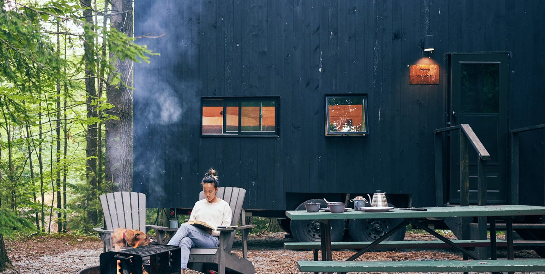
Formerly Getaway House, Postcard Cabins are tiny cabins nestled in nature to allow guests to escape to.
TEAM
Sr. Product Designer: Jonathan Lee Gonzales
Developers: Matt Jacobs / Aleksander Ogrizovic
Product Manager: Danny Canarick
Creative Direction: Lance Gorton
Marketing: Courtney Colavita / Carly Lorberbaum
YEAR
2022–2024
Booking Flow
The most significant flow for Postcard Cabins guests is the booking process, where they plan their stay at a nearby cabin. A key pain point the brand identified is that more than half of guests abandon their booking after the third step. The primary objective of redesigning the booking flow was to simplify the process, making it more intuitive and seamless, so guests can complete their reservations without dropping off.
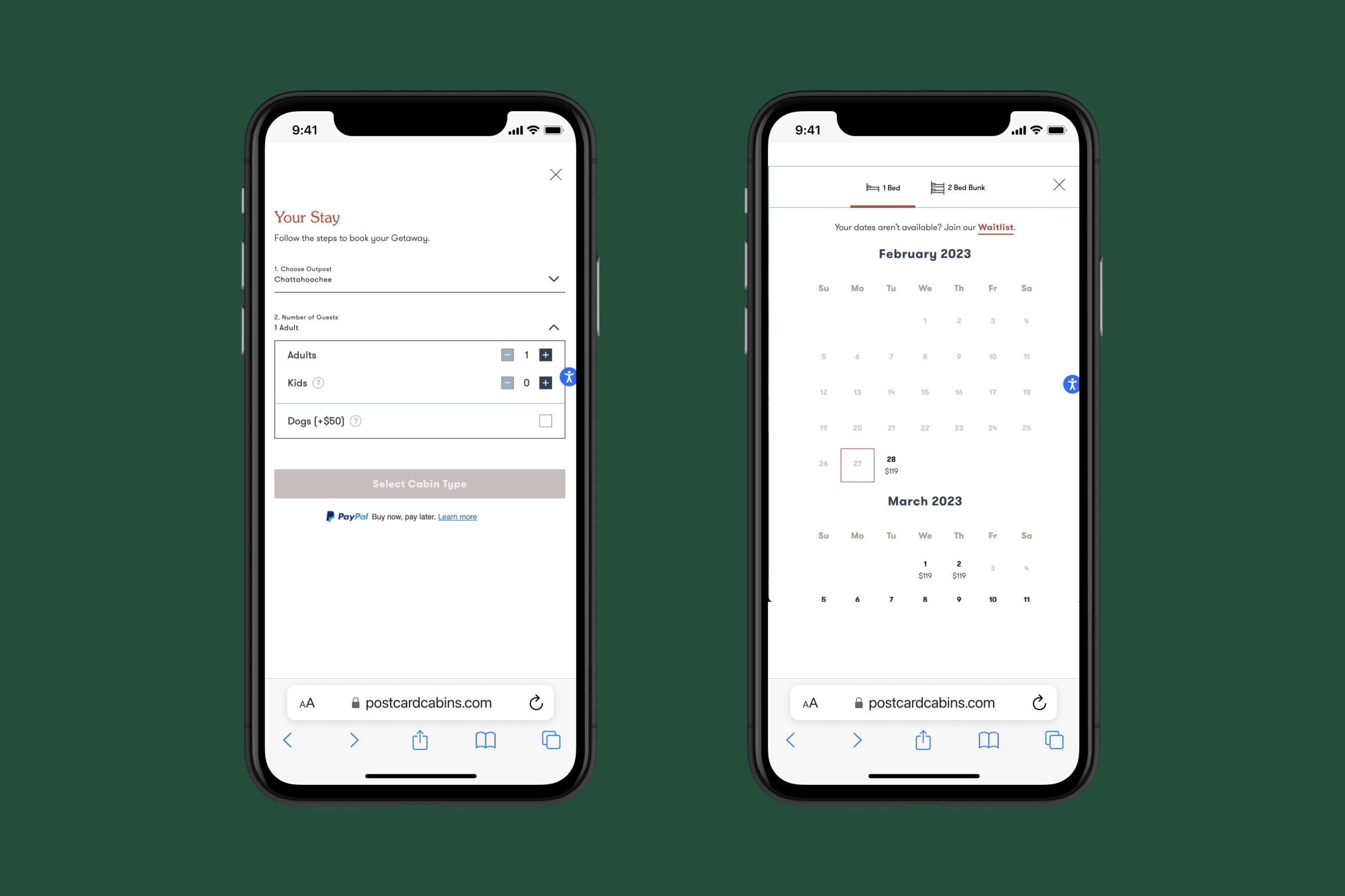
Previous Booking Flow
These are the first steps guests encounter when they click the "Book Now" button. A key insight we discovered is that the majority of our users are accessing the site via mobile devices, which had the lowest conversion rates.
Hypothesis
Based on a competitor analysis, we identified trends that Postcard Cabins' booking experience was missing compared to others:
- A guided, step-by-step flow
- Engaging visuals to enhance user experience
- Optimized typography and UI design
- An ease of use
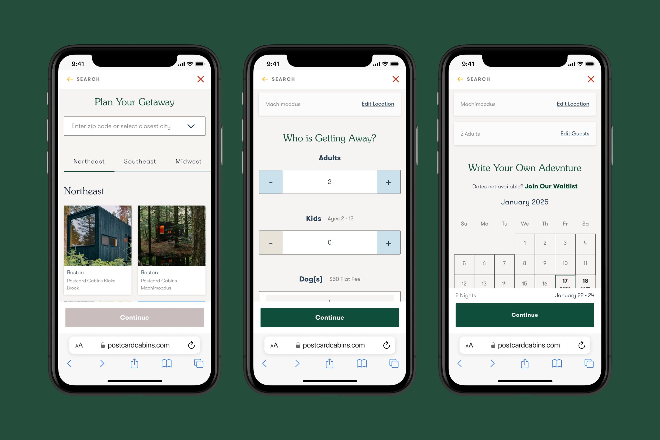
Design
When approaching this design, we prioritized a mobile-first experience. Rather than overwhelming guests with all the booking steps at once, we broke the process into three main categories: Where, Who, and When.
Each category is essential, so the flow guides users through them step by step, with a larger UI that ensures easy scanning and navigation on mobile devices.
Once the main steps are completed, guests can focus on finer details, such as selecting their preferred cabin type, choosing add-ons to enhance their stay, and completing the checkout process. The checkout now includes streamlined, one-click payment options like Apple Pay, making the final step quicker and more convenient.
Testing & Learning
Before launching, we conducted user testing to ensure the flow was optimized and ready for deployment. We tasked users with a few key objectives, with the most important being: Can you successfully book a trip with complex details?
After completing the booking process, we asked participants: “On a scale of 1 to 10, with 1 being the most difficult and 10 being the easiest, how would you rate the booking experience?”
80% of users rated the experience between 7 and 10, with 9 being the most common score. When asked if they would consider booking again in the future, 90% said yes.
We also gathered user feedback, which led to further refinements—such as increasing text size, making prices more prominent, and eliminating an extra step in the checkout process.
Results
Following testing and adjustments, the new Booking Flow launched on October 23, 2024. Prior to the redesign, the mobile conversion rate (CVR) averaged around 1%. By the end of 2024, mobile CVR surged to 2.8%, even briefly surpassing desktop CVR.
Not only did mobile conversion improve, but desktop also saw gains, peaking at a 7% CVR compared to its previous average of 4%.
It was clear that the new Booking Flow made the process easier and more engaging for users. Since the launch, we’ve continued to learn and iterate, with upcoming updates focusing on improved cabin rates, guest checkout, and post-checkout add-ons.
City Pages
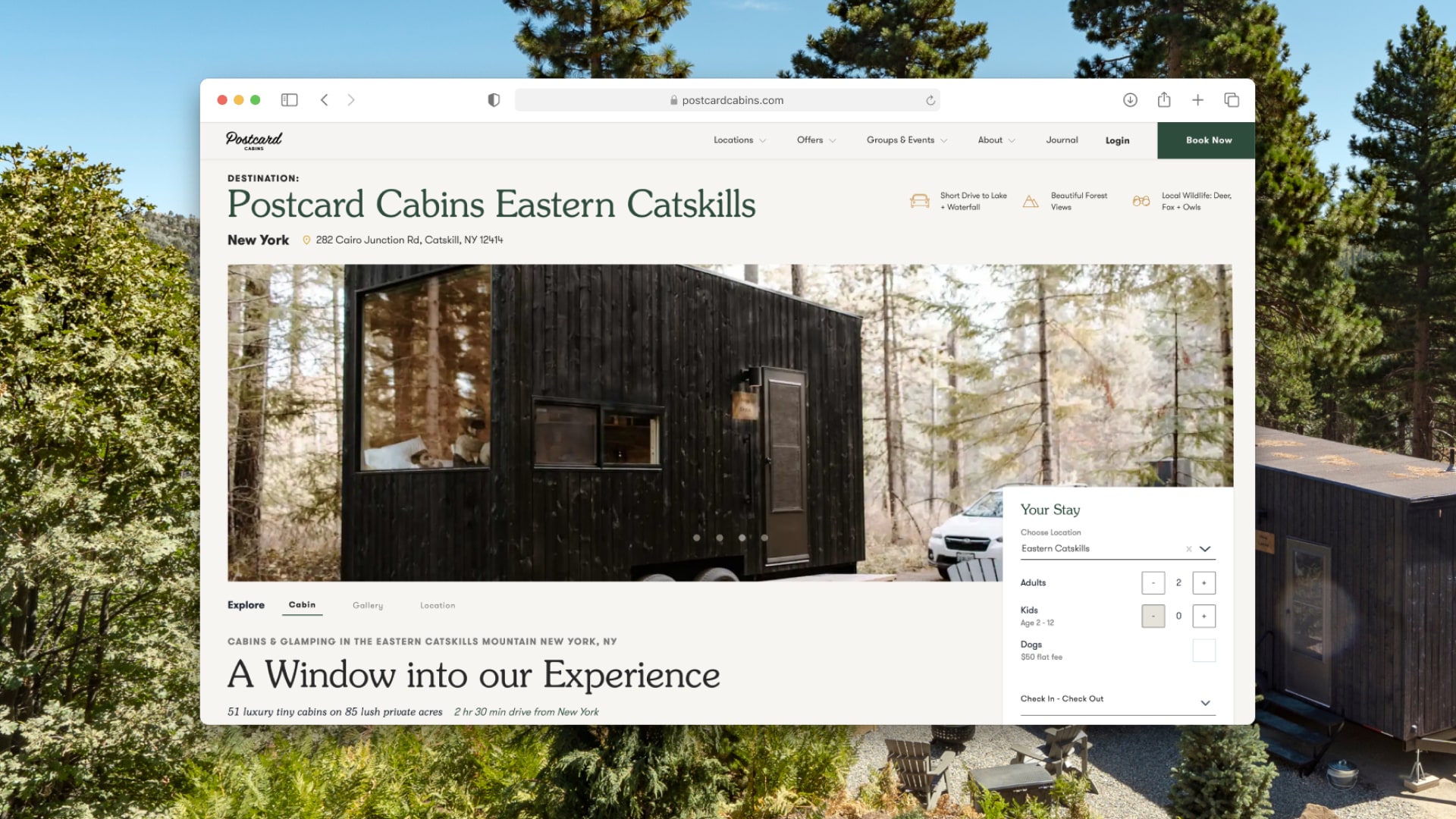
The most prominent page type on the Postcard Cabins website is the city page. With 29 locations, it is important for each to be able to showcase their uniqueness and serve locals a personalized look into what a nearby cabin can provide.
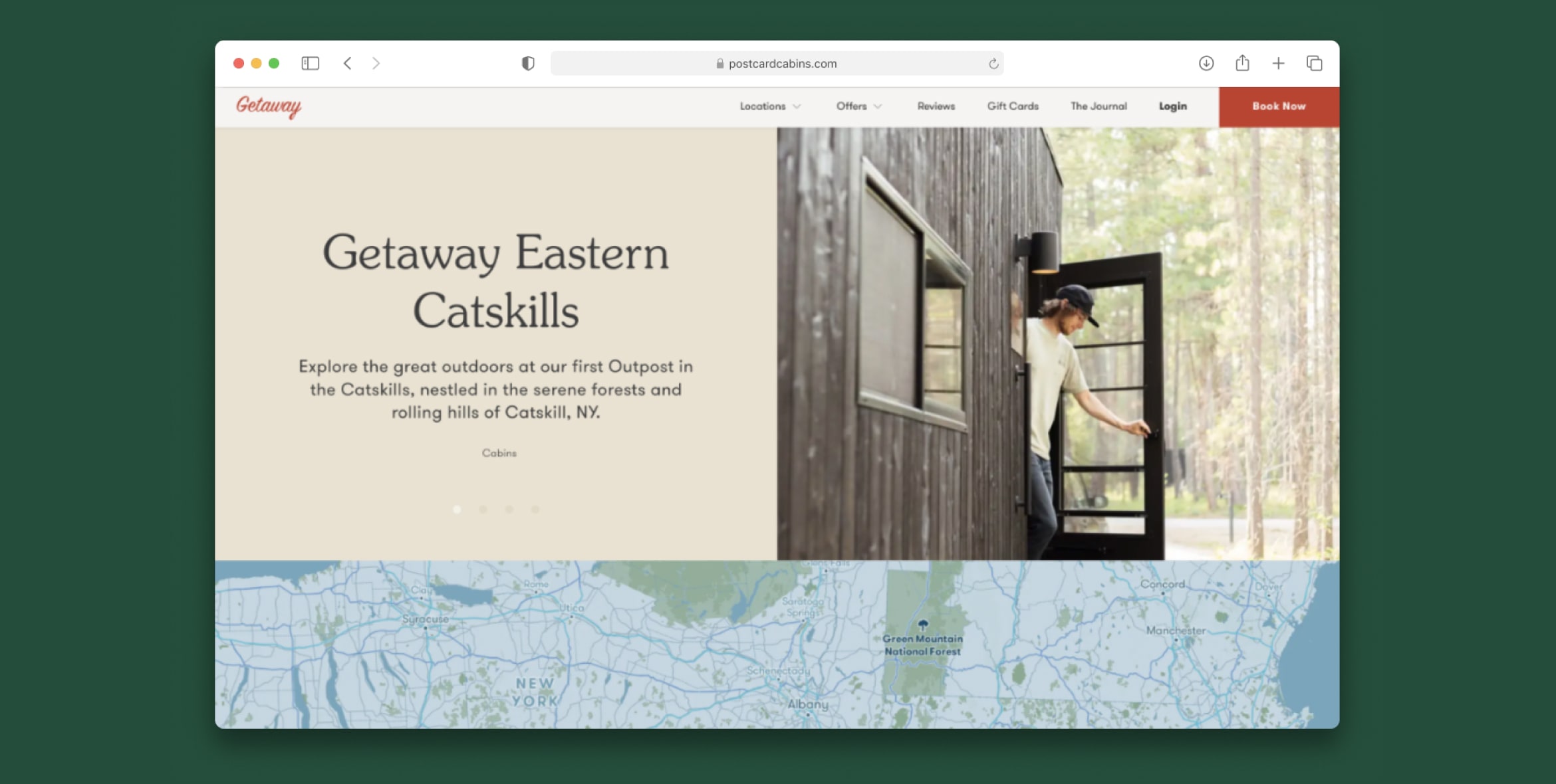
Before
In 2022, the average conversion rate (CVR) for our city pages was 0.75%. After conducting a competitor analysis, we identified key areas where our city pages were lacking:
- A clear hierarchy of relevant information
- Localized content tailored to each specific location
- Distinct differentiators that set Postcard Cabins apart
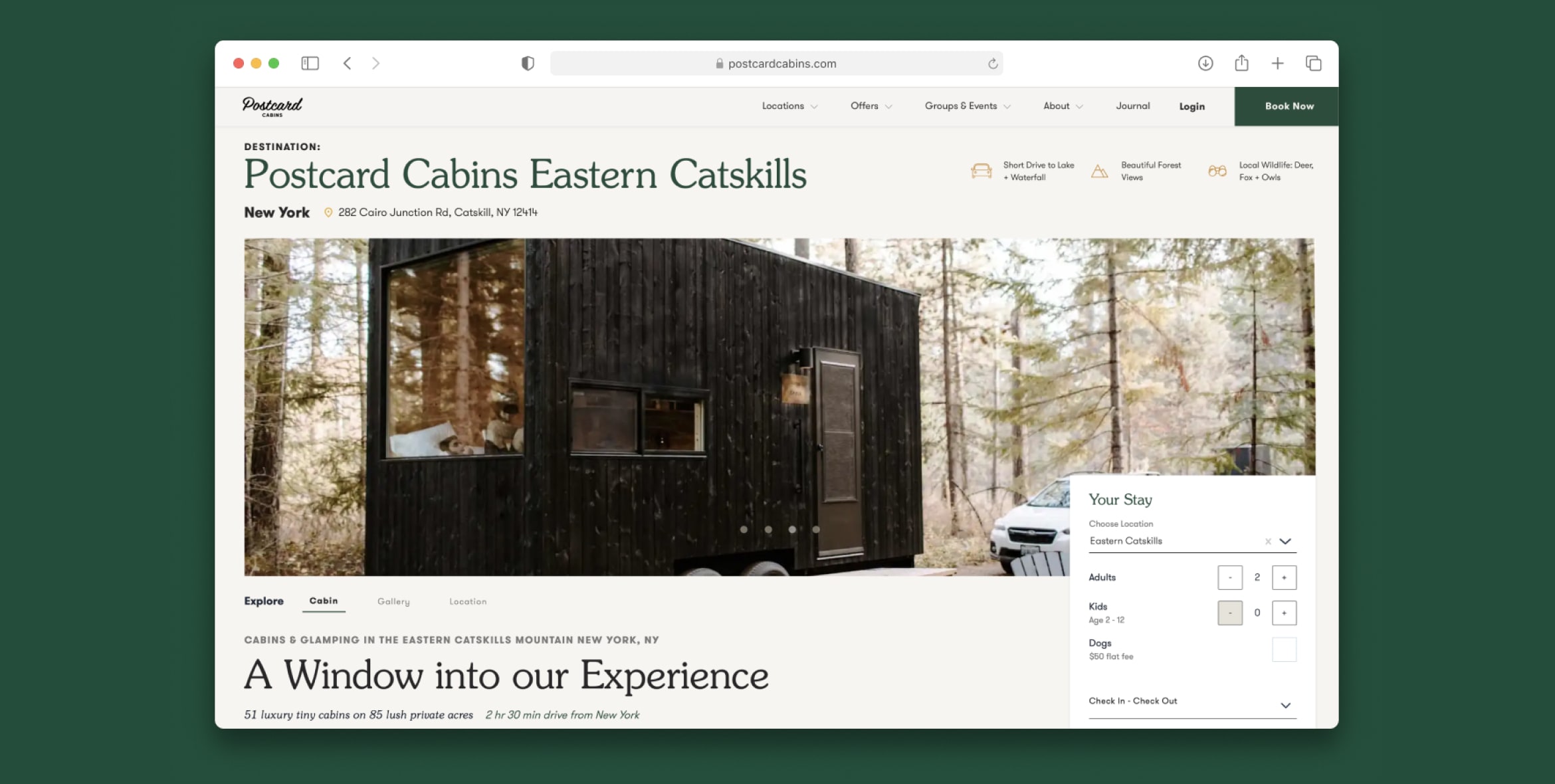
After
When designing the foundation for each city page, we focused on delivering the key information that guests were most likely to seek. To ensure accuracy, we collaborated with our community team, who interact with guests daily and have valuable insights into their needs. This included details about the cabins, the location, and local activities.
The "above the fold" section highlights the most critical elements, such as the unique features of the location, driving distance from major cities, the number of available cabins, and a booking widget for easy access.
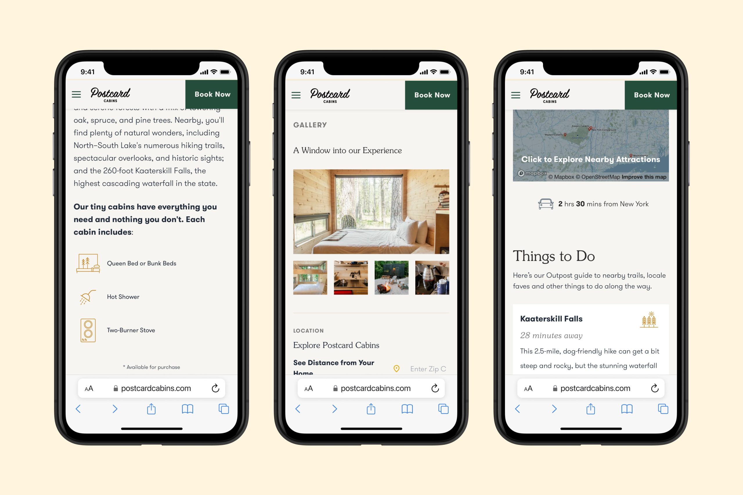
Below the fold, users will find localized copy, key amenities, a photo gallery for visual reference, a location tool to view the distance from their current location, and a curated "Things to Do" section featuring local highlights.
Results
- Conversion rate (CVR) improved from 0.75% to 2%.
- Heatmaps indicate increased user engagement, with visitors interacting with more elements.
- Users who view a city page are nearly twice as likely to book a stay compared to those who don’t.
Design System
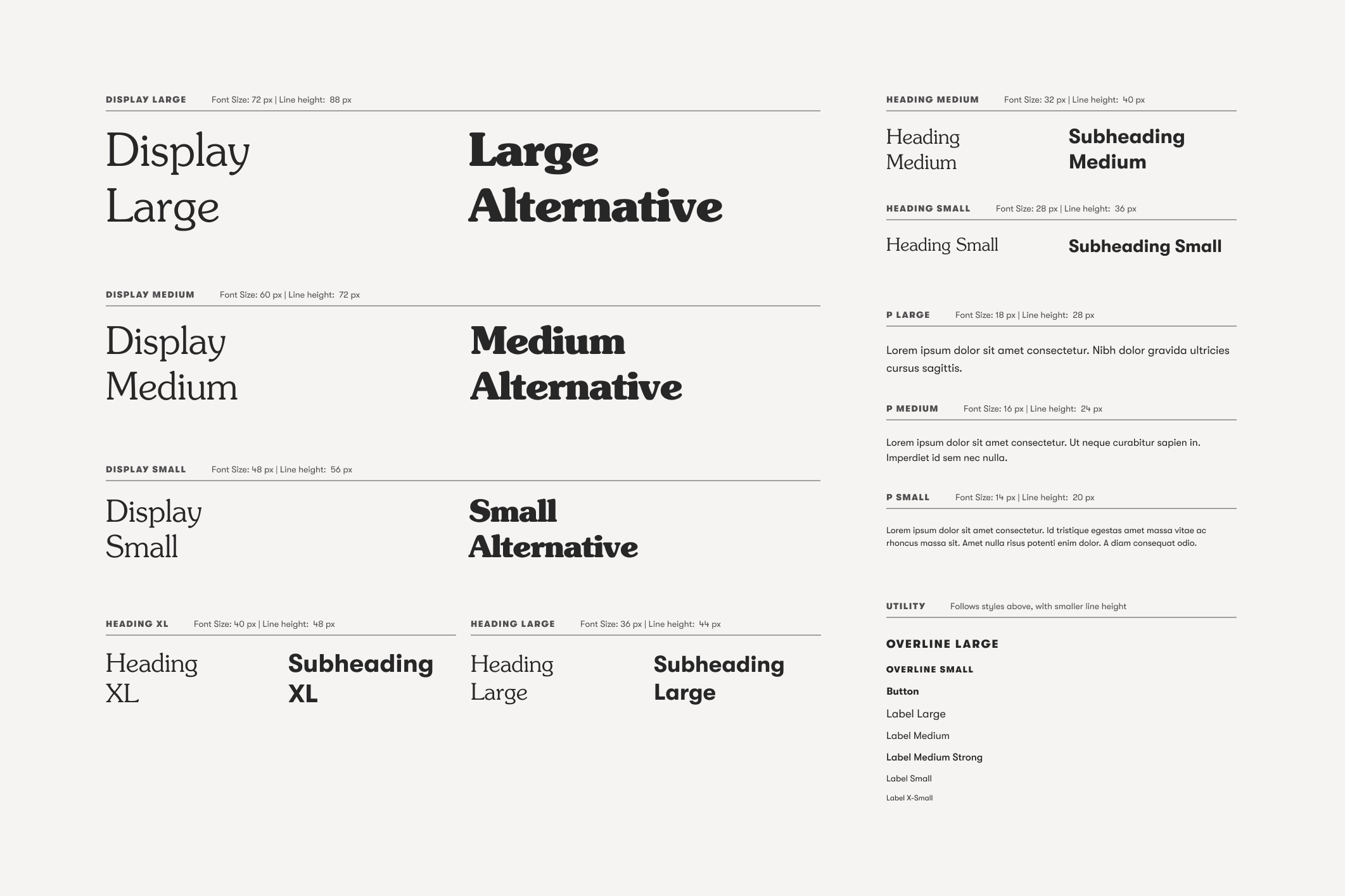
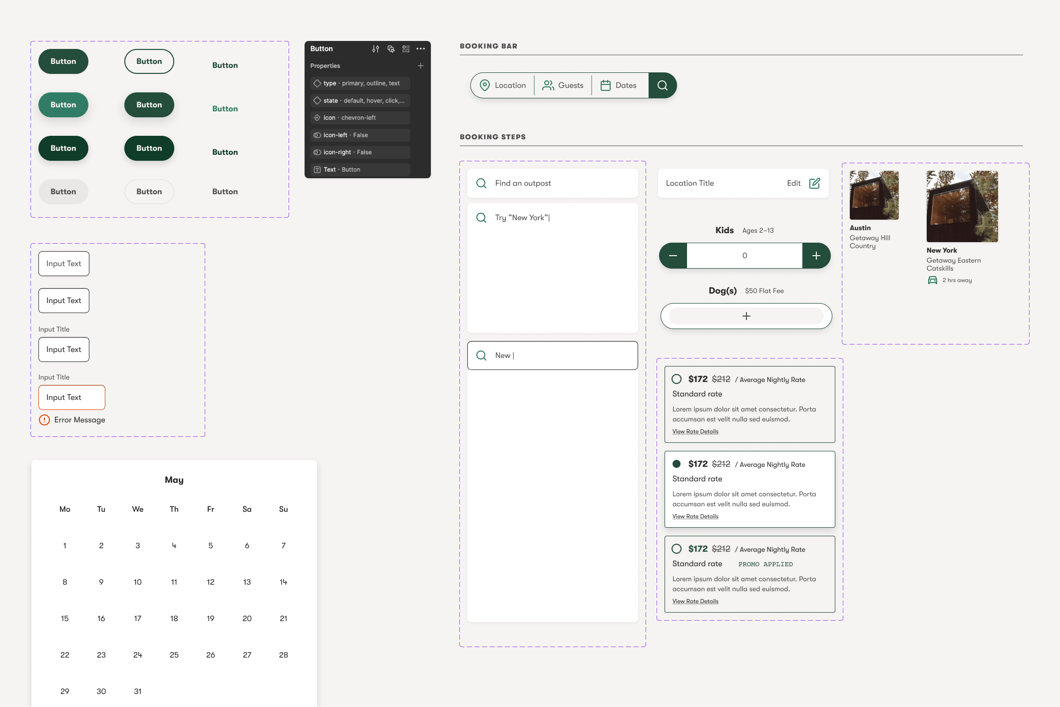
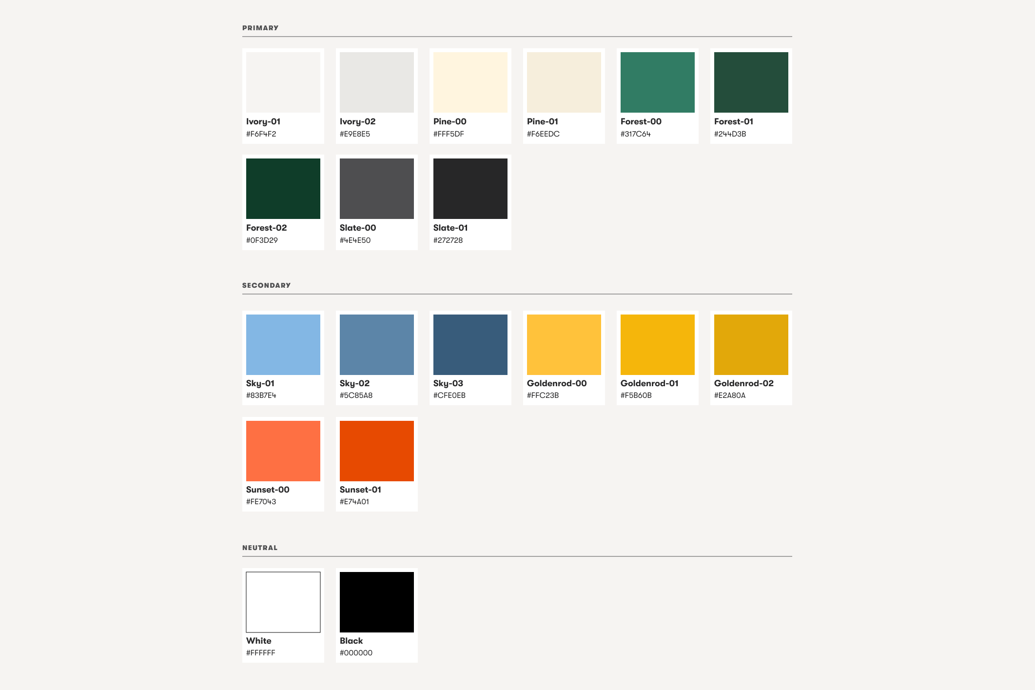
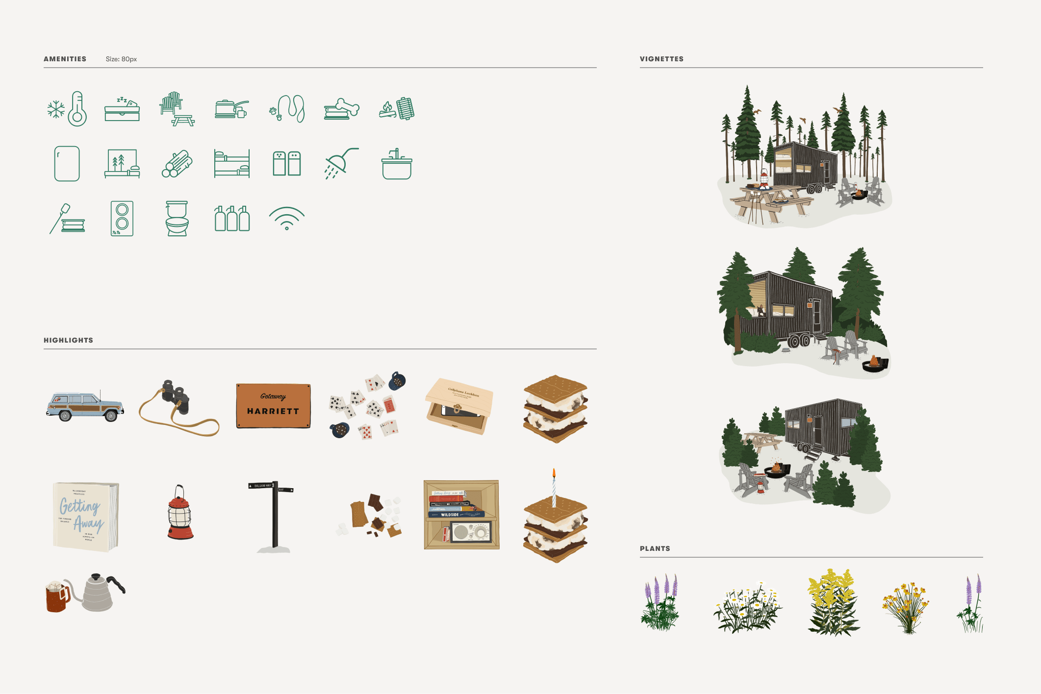
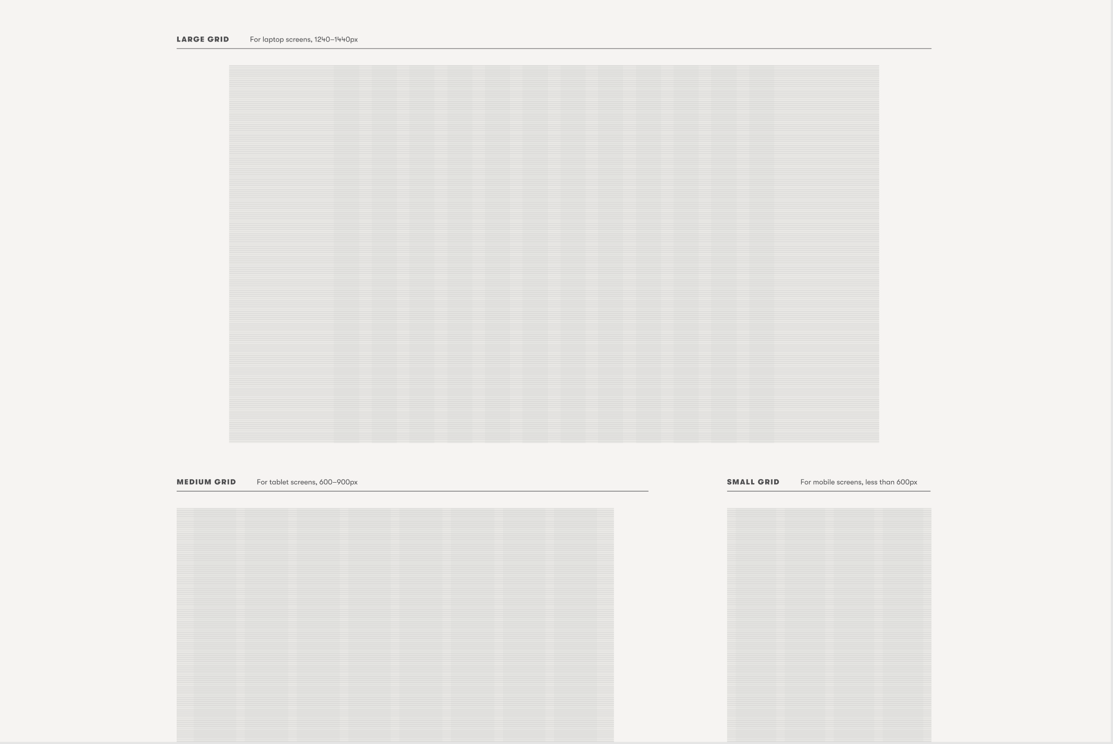
Throughout these projects, establishing a cohesive design system was essential to ensure consistency across both our website and the channels through which guests discover us, including paid and organic media. A design system was built from the ground up, starting with core elements like grids, typography, and an accessible color palette. From there, we expanded to include reusable components. Additionally, we developed a centralized library of illustrations, icons, and media assets commonly used across our designs.
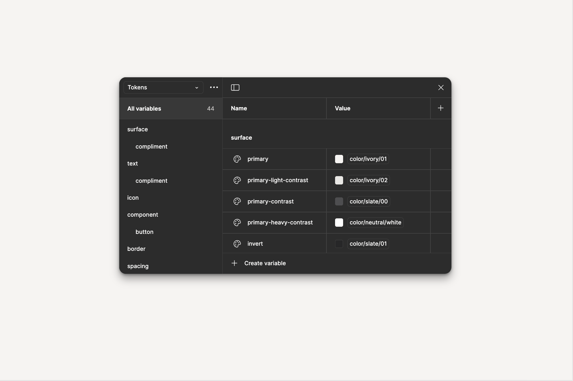
A curated set of core elements from the newly established design system, created in Figma. For the first time, design tokens were introduced to ensure scalability and streamline organization for both our developers and Creative Team.
