WEB DESIGN
Reef Industries
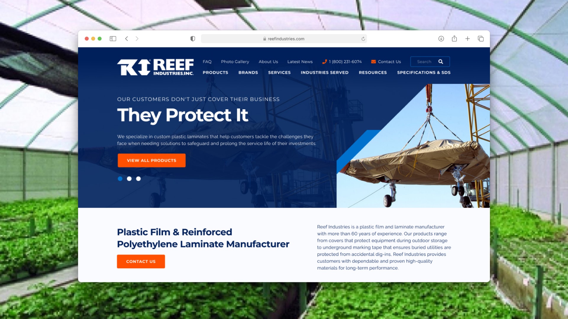
Reef Industries is a custom plastic film and laminate manufacturer with more than 60 years of experience.

TEAM
Web Designer — Jonathan Lee Gonzales
Developer — Manuel Soto
Project Manager — Sal Vidaurre
Team Lead — Lauren Kunze
SEO Specialist — Mallory Sandlin
AGENCY
YEAR
2020
Project
Reef Industries' main goal for this new website was to be able to take on larger projects within the industries they serve. In addition, it was important to create an easy user experience to easily find items, as well as include a library of resources and galleries across internal pages.
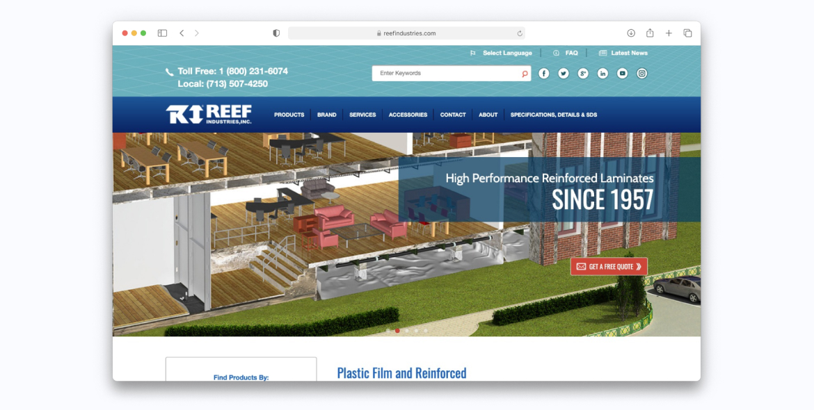
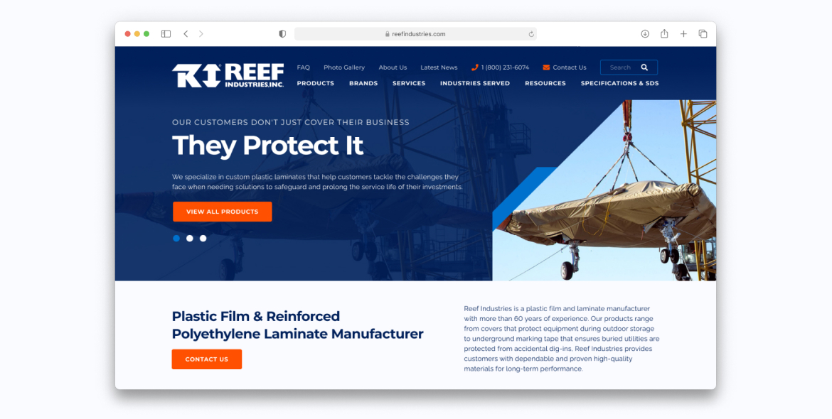
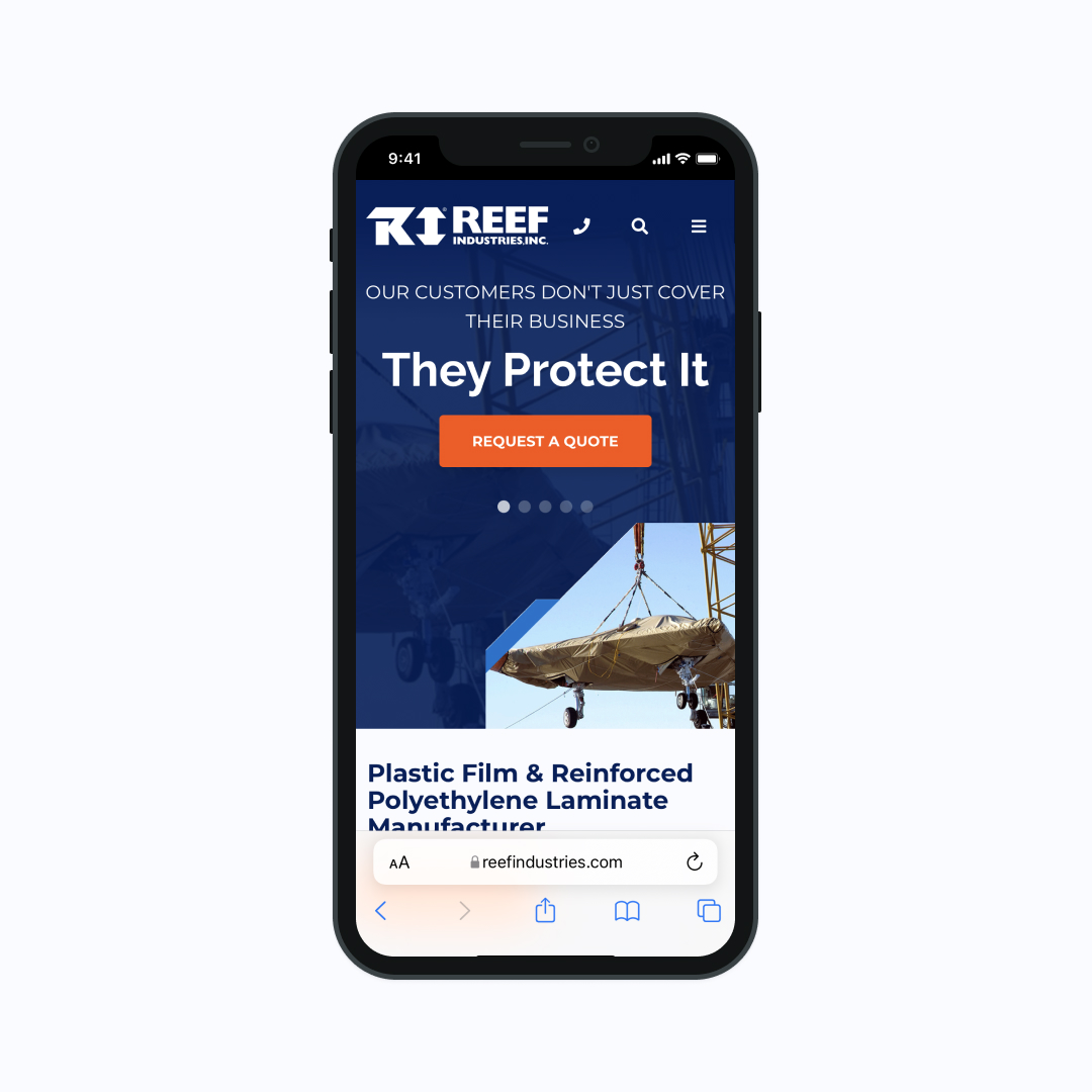
A snippet of above the fold on the old home page vs the new design. The new design showcases a refreshed design system and a banner image showing the capability that Reef has to appeal to larger projects.
Process
Aside from being capable of taking on large cover tarp protection projects, Reef Industries offered much more to their clients. With much experience, Reef is able to offer services, has an in-house design/engineering team to offer custom solutions, and also distributes hundreds of products of familiar brands to their clientele.
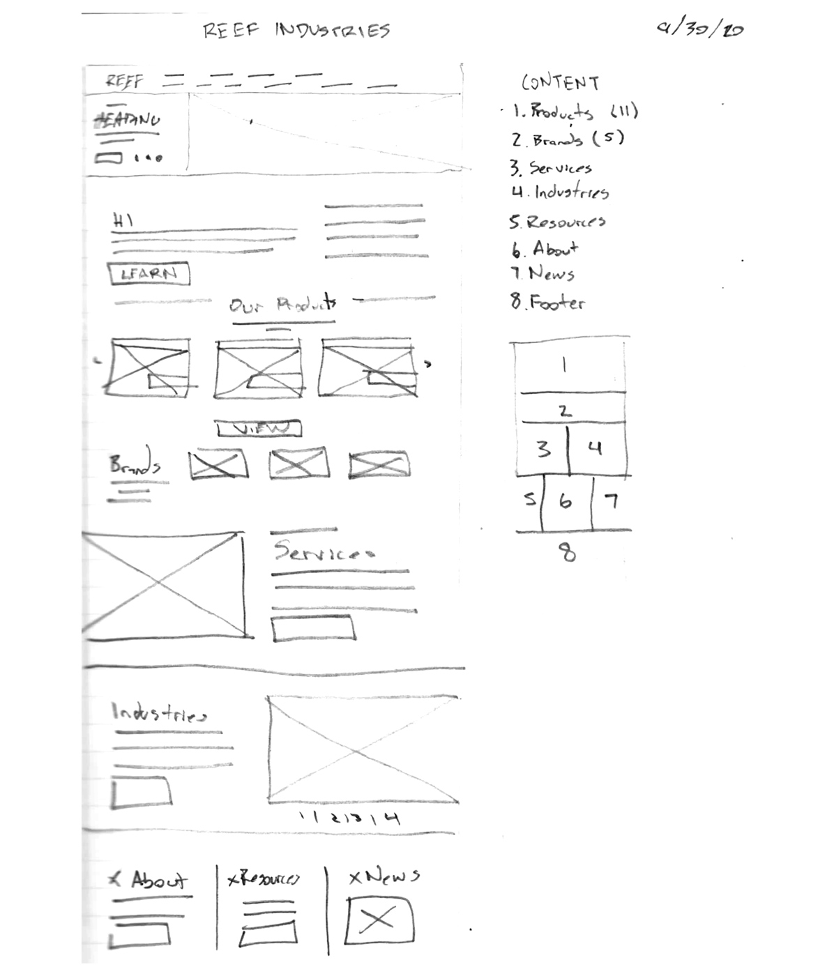
For their home page, I wanted to convey all of this briefly and give the user the opportunity to learn more about each item. To accomplish this, there are large sections with imagery to easily visualize what Reef offers.
To showcase their hundreds of products, a mega nav was also designed with a large search bar as well to help the user drill down exactly where they need to.
Design System
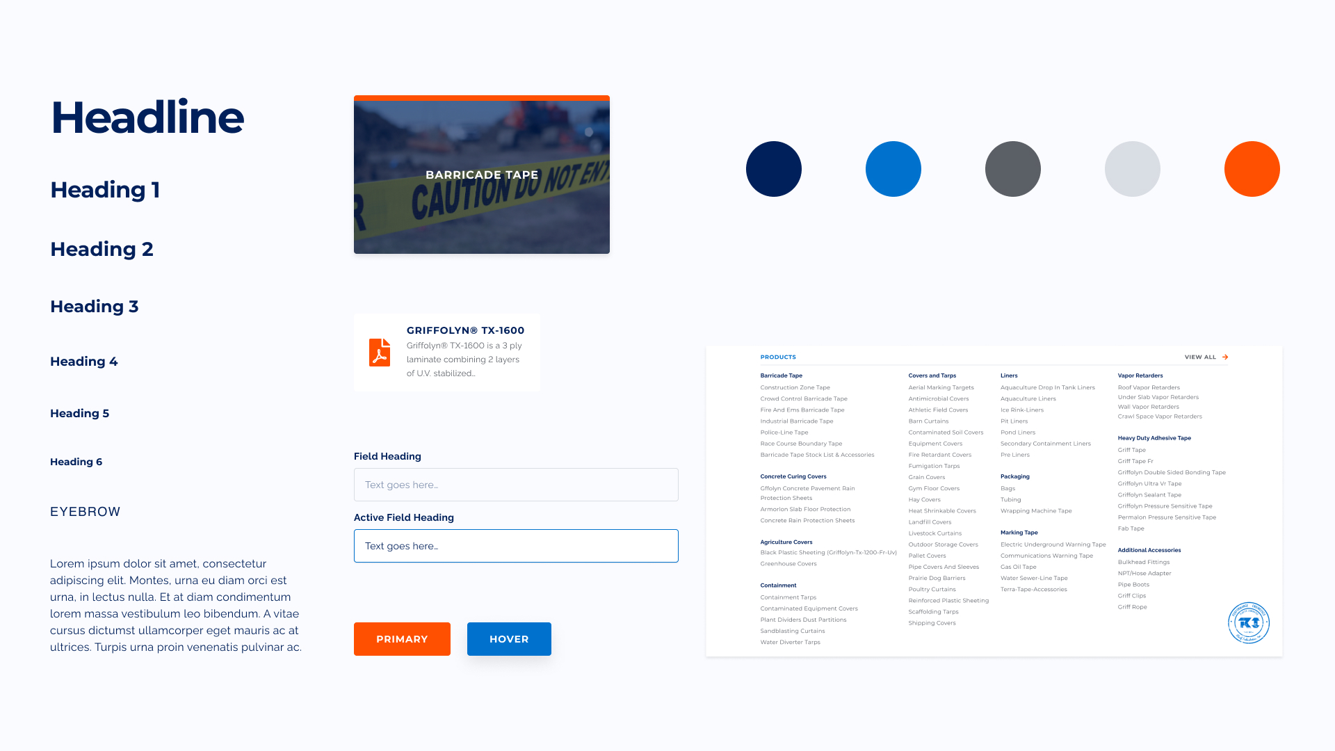
A sample of some of the typography, colors, and components used throughout the website, including the mega-navigation. Reef wanted to align their print material with their web material, so their Pantone colors were converted to RGB to be as close as possible across screens, with an extended palette for UI only.
User Flow
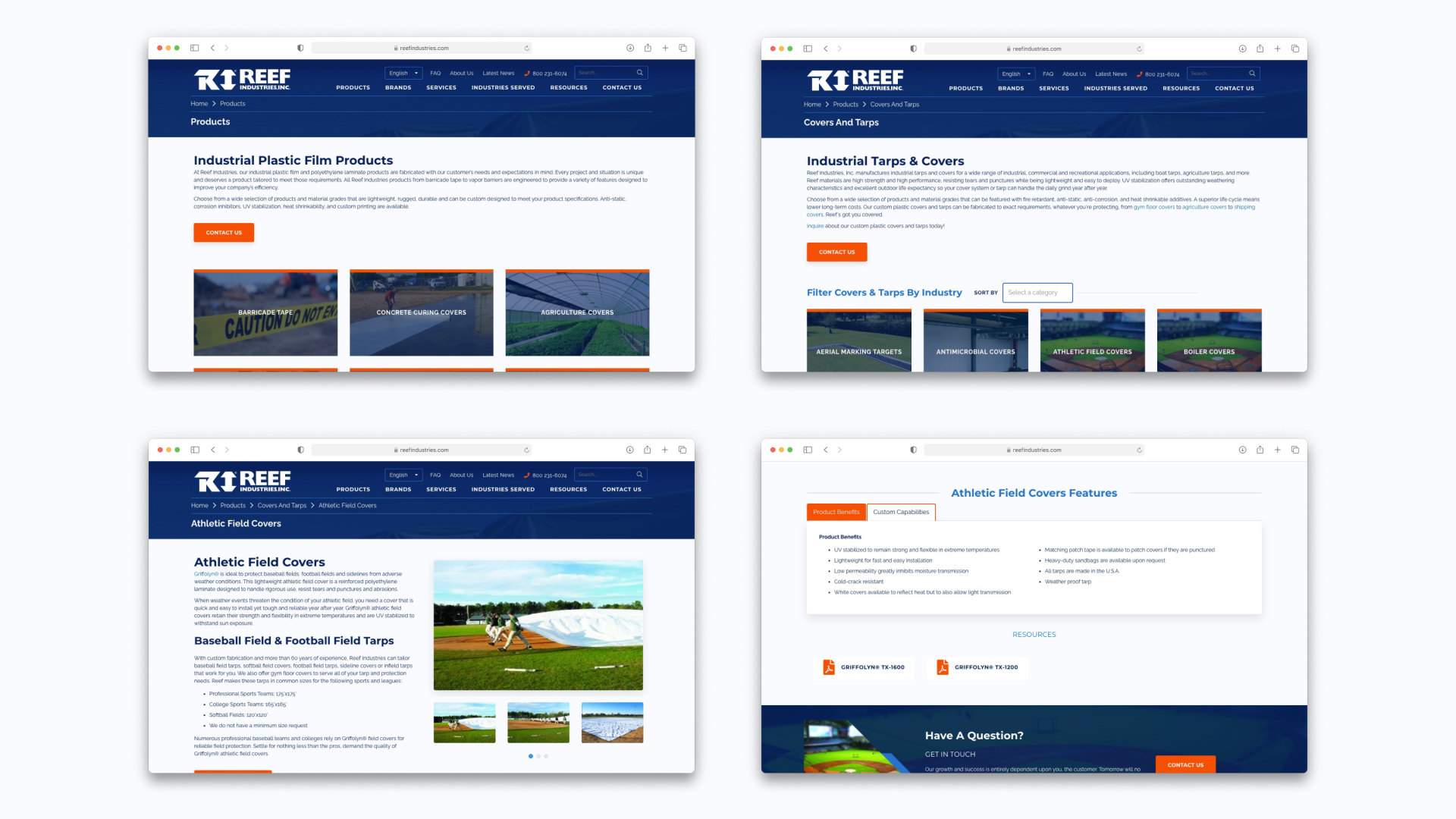
From the home page, the user can click through any of the buttons to learn more. Aside from that, they can either search or use the navigation to go to where they need to. However, we made sure the user path still made sense without using the nav or search. The above shows the path the user takes from products and drills down to the most specific product type.
It was important to show more and more information as the user drills more down. The end result is the third image, where a large gallery can be seen of the product they are viewing, more content, a tabbed content system for a list of features and capabilities, PDF buckets for additional resources, and finally the contact call-out below which will then take the user to a short form to contact Reef.
