WEB DESIGN
MMB Bearings
One of the nation's largest ball bearings distributors, MMB Bearings provides quality precision bearings to various industries.

TEAM
Web Designer — Jonathan Lee Gonzales
Developer — Shonna Orechio
Project Manager — Grant McCracken
Team Lead — Amanda Whittington
SEO Specialist — Aileen McComiskey
AGENCY
YEAR
2020
Project
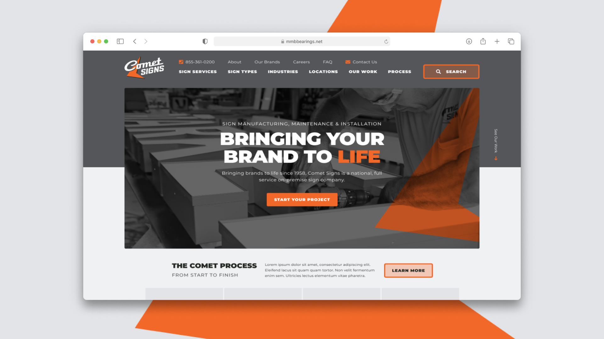
MMB Bearings needed a new website to showcase their potential to be able to serve large customers—OEM's for example, being their target audience. MMB is a huge stocking distributor of all types of bearings, which required a site that can house a large inventory and have users easily find what they were looking for while learning about benefits and features for their bearings.
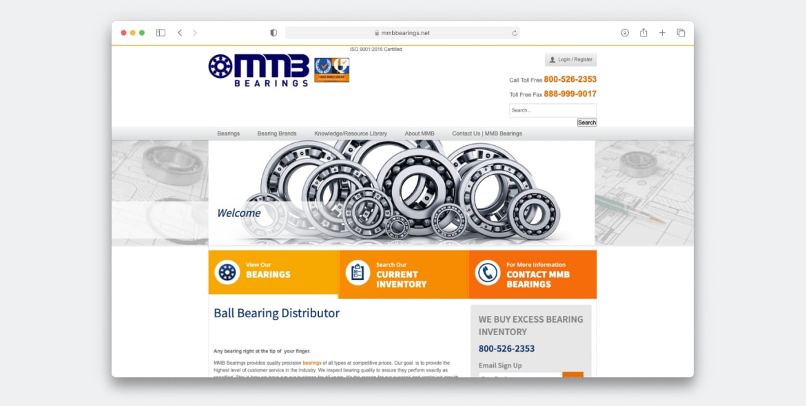
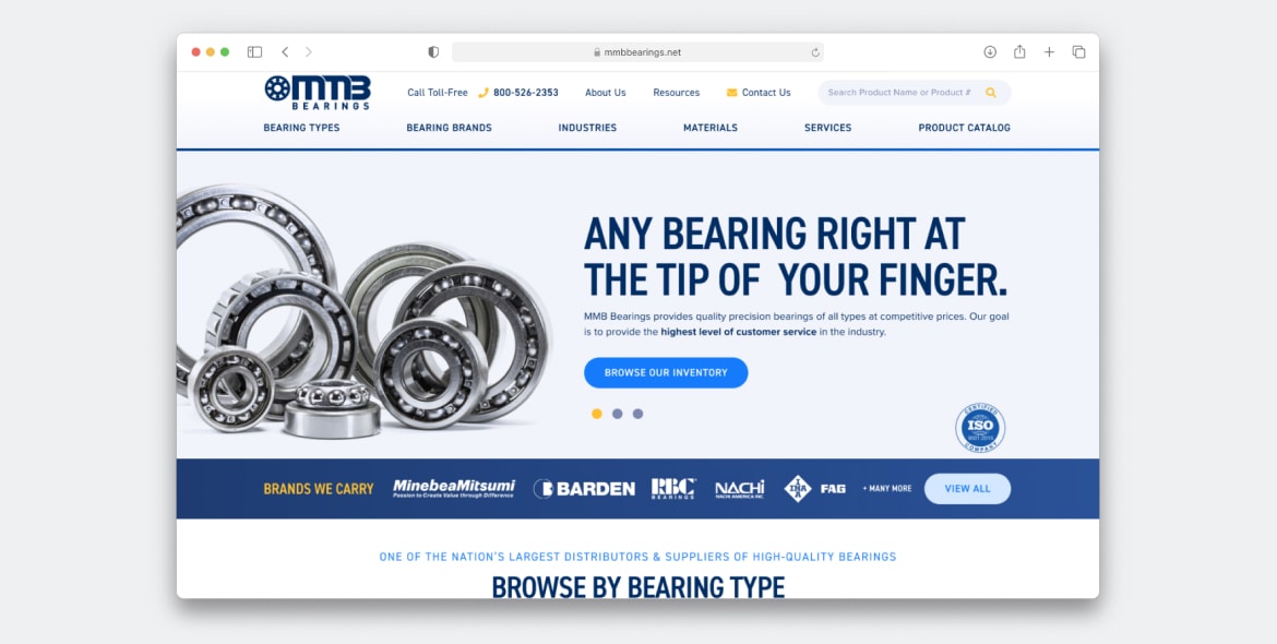
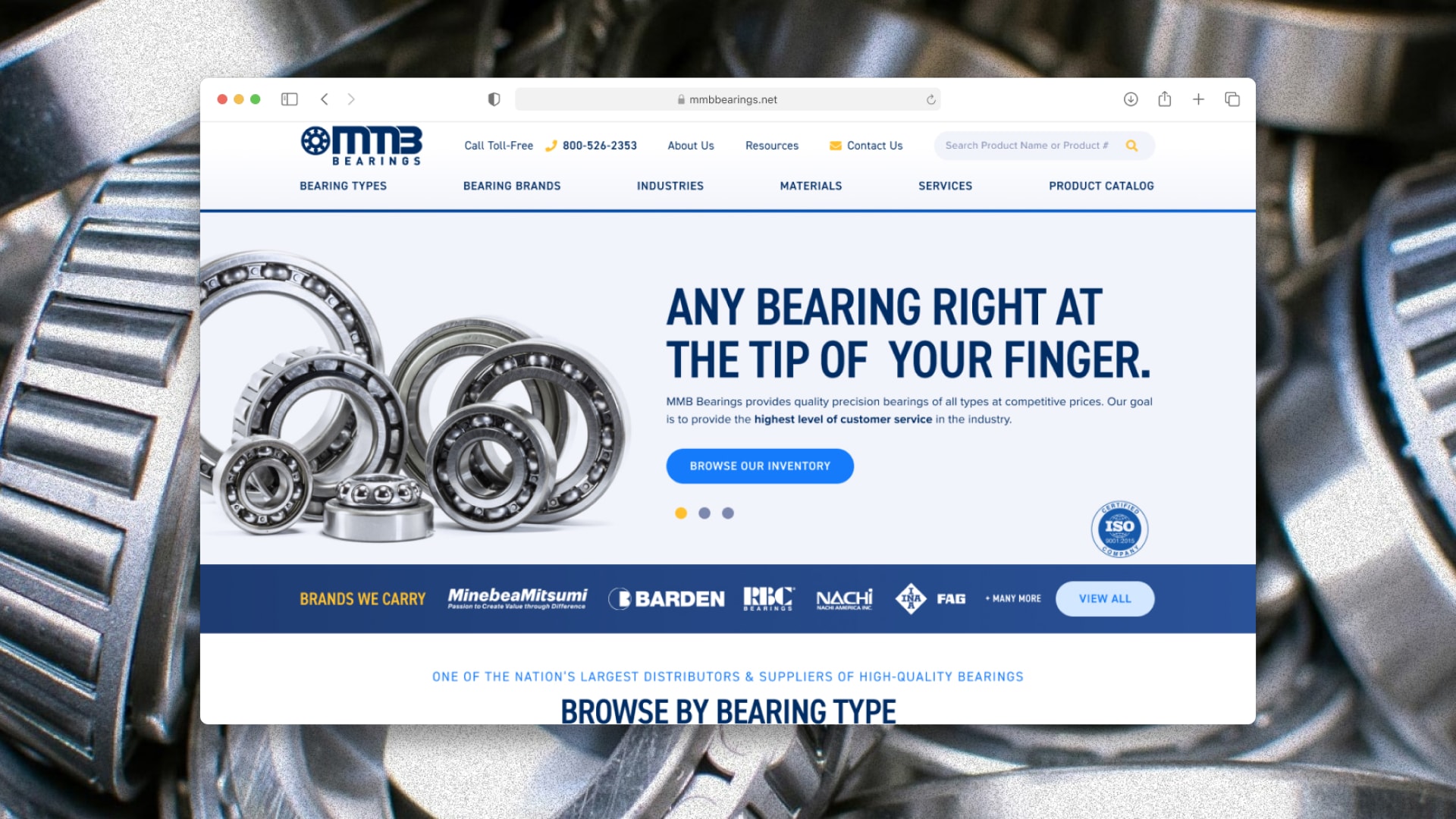
A snippet of above the fold on the old home page vs the new design. The new design showcases a refreshed design system, with strong messaging and some familiar brands they carry that their customers will know.
Process
One of the big challenges for this site that MMB proposed was having fewer clicks for the user to find what they were looking for. I wanted to approach this immediately on the home page, to create a simple overview of products, brands, industries, services, etc. while still being able to learn more.
Two important sections to call out here are the Ball Bearings section and Industries section. The Ball Bearings section utilizes a left and right toggle system, with the highlighted product displaying a quick 3–4 point list on the left side highlighting features or advantages.
The industry section is a large tabbed sytsem showcasing a large image, short snippet of content, and most importantly, a quick list of commonly used bearings in that industry.
This wireframe and stratgey was proposed to MMB in a prototype, and with the help of MMB, they were able to successfully put together short lists of advantages and common industries, so the user could learn plenty just from the home page on the site, and of course click on a learn more button to take them to even more content.


Design System
A sample of some of the typography, colors, button styles, and fields used throughout the site. This was built after wireframing and utilizes a new color palette, inspired by their old site that was a standard blue and orange. The primary blue color from their branding was expanded to include multiple tones and gradients, while the orange was substituted with a yellow to easily highlight buttons for the user to click on. The typography was also greatly reworked to show strong headlines and easy-to-read paragraph text.


User Flow
After browsing the overview of information on the home page, the user can click on a learn more button to take them where they would like to learn more about. Ideally, the user will follow the path above, or some version of it. Starting with general pages to the most specific page and finally converting. The first shows a landing page for Bearing types, where the user can hover over the buttons to get a brief of info. Once they click into one of those, they will see more content, application, benefits, etc. and be introduced to sub-categories. Finally, once the user finds the specific bearing they are looking for, they can click the request a quote button which will take them to the form below.
The form was designed around data TopSpot had from previous conversions. The website's old form was very general, so users had to type in sizes, qty, etc just in the comment box. So on this form, we made sure to include specific fields for the user to type into, which will also help better organize the information on MMB's part.